Simplifying geopolitical intelligence workflows for analysts and editors.
A fragmented editorial back office rebuilt into a feed-driven workspace, where analysts review, enrich and publish strategic content without leaving the rhythm of their work.
- Role
- Senior Product Designer
- Focus
- Internal editorial back office
- Duration
- ~3 months
- Platform
- Desktop · Web app
- Year
- 2021
A platform for understanding how the world moves.
AXIS is used by enterprise and government affairs teams to monitor political and market landscapes, tracking stakeholders, regulation, events and the people that shape them. Behind the customer-facing intelligence product sits a high-volume editorial pipeline. That pipeline is what I redesigned.
Enterprise strategy, government affairs and risk analysts.
Monitors geopolitical developments, regulation, events and influence networks.
The internal editors and analysts processing intelligence content every day, not the end customers.
A back office built one screen at a time.
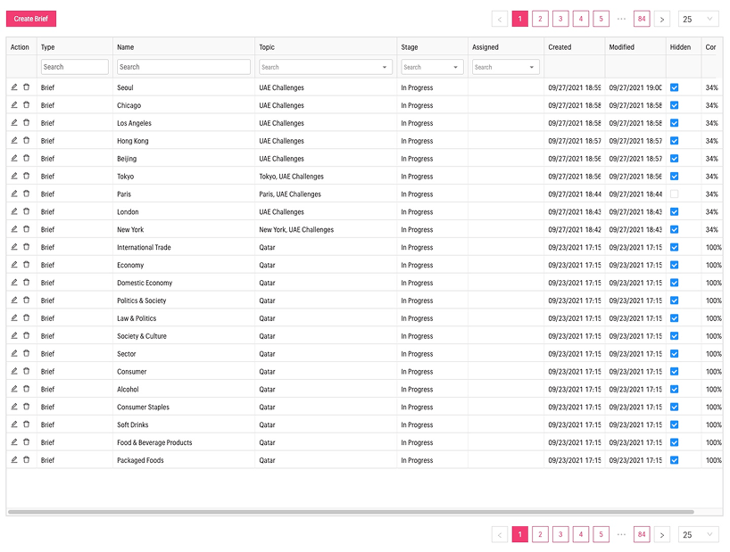
The original system had grown organically across years of feature requests. Editors moved between disconnected admin pages, tables, modals and lookup screens, to do a single editorial task. Reviewing and publishing one item meant dozens of clicks across screens that didn't share state, context or visual language.
Recurring fragments from editorial sessions, support tickets and shadowing the team on a normal workday.
"Reviewing one article required jumping across 4 to 6 screens."
"No sense of what's new, in progress or already published."
"Tagging entities, topics and events lived in separate, unrelated tools."
"Status changes weren't reversible without admin help."
"I couldn't tell if a piece had been seen by anyone else on the team."
The redesign started inside the editors' day.
Before sketching anything, I sat with editors and analysts individually, watching them process real content, asking where the screens got in their way, and mapping the mental model they had already built around a system that didn't reflect it.
1:1 conversations with editors across shifts and seniority.
Observing real review sessions, end-to-end.
Reconstructing the actual path from intake to publish.
Counting clicks, screens and dead ends per task.
I open ten tabs to publish one article. I lose track of which one is the truth.
I know the article is fine in the first five seconds. The system takes me five minutes to say so.
Tagging a country, a person and an event are three different mental models. Why?
I want a feed. Not a database.
They mentally queue articles the way they read news, chronologically, scannable, dismissible. The table view fought that instinct.
Most accept/reject calls happen within seconds of reading the lede. The interface should let them act there, not three screens later.
Tagging actors, plots, regions and events is where editors add value. That work deserved the primary surface, not a sub-modal.
From raw intelligence to published insight.
The editorial pipeline transforms a noisy stream of incoming sources into structured, enriched intelligence ready to surface inside the customer-facing AXIS product. Simplifying it meant first making it visible.
Articles, reports and signals pulled from hundreds of sources.
Quick scan, accept or reject, prioritise by relevance.
Tag actors, plots, regions, events and briefs.
Push enriched content into the customer-facing product.
Design the workflow, not the screens.
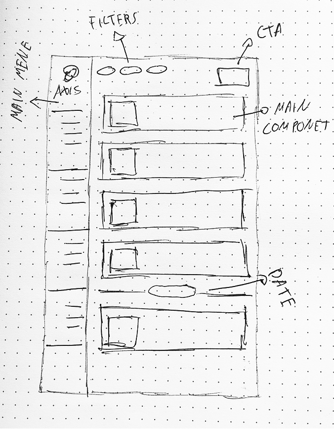
The shift was less visual than structural. Instead of a back office made of admin pages, AXIS became a workspace shaped around the editor's actual task: read, decide, enrich, move on.
A chronological, scannable stream replaced the dense table view as the home of editorial work.
Accept, reject, prioritise and assign happen inline, never behind a modal or a separate route.
Tagging actors, plots and briefs lives next to the article, not in a different tool.
Every item shows its state, new, in review, published, archived, without an editor having to ask.
Reading, hovering, selecting, dismissing, borrowed from interfaces editors already use every day.
Most operations are one click and undoable. No destructive admin moments.
Sketches before pixels.
The structural shift was tested on paper and in low fidelity long before any UI work. The goal of these explorations wasn't aesthetic, it was to validate that a feed-shaped workspace would actually carry the editorial workload.
A workspace shaped around the work.
The redesigned back office is a single editorial surface. Editors scan a feed, open items in place, enrich them, and publish, without leaving the rhythm of their work. The interfaces below are modern reconstructions of the shipped product.

One scannable surface replaces the table back office.
Accept, reject, assign, without leaving the article.
Tagging and event creation live beside the content.
Status, ownership and history are always on screen.
A lightweight system, built to scale the workflow.
The back office had no shared visual language before this work. Alongside the redesign, I introduced a small but disciplined component system covering the patterns editors actually used every day, cards, tags, list states, primary actions and form fields.
One way to render a card, a tag, a status. Fewer rules to memorise.
New screens assembled from known parts in hours, not weeks.
Future entity types, statuses and workflows fit the same grammar.
A fragmented back office became a workspace.
The redesign collapsed an admin built out of disconnected pages into a single editorial surface, one where decisions, enrichment and publication happen in flow. The work shifted the team from operating a database to running a newsroom.
Editors stopped bouncing between admin pages to triage a single item. Review, enrichment and publication happen inline in the feed, which cut the number of clicks per article from double digits to a handful and let the team clear the queue without losing rhythm.
One layout, one tagging grammar, one set of actions across every entity type. Analysts no longer had to remember which screen behaved which way, which freed attention for the actual editorial judgement the work demands.
Status, owner and recent history sit on every card and every detail view, so the team stopped pinging each other on chat to ask who was on what. Hand-offs between shifts and desks became visible inside the product itself.
The lightweight system meant new entity types, new workflows and new desks could be added by composing existing patterns, instead of designing another bespoke admin screen. The platform kept growing without the back office fragmenting again.
Designing for internal users taught me to treat operational speed as a first-class product quality. The interfaces analysts live inside every day deserve the same care we give the customer surface, usually more, because the cost of friction compounds across thousands of decisions a week.
AXIS · Senior Product Designer case study. Editorial back office redesign, 2021.