'%3e%3cpath%20fill-rule='evenodd'%20clip-rule='evenodd'%20d='M4.3134%2038.8206H34.5072C36.8894%2038.8206%2038.8206%2036.8894%2038.8206%2034.5072V4.3134C38.8206%201.93117%2036.8894%200%2034.5072%200H4.3134C1.93117%200%200%201.93117%200%204.3134V34.5072C0%2036.8894%201.93117%2038.8206%204.3134%2038.8206Z'%20fill='%23007EBB'/%3e%3cpath%20fill-rule='evenodd'%20clip-rule='evenodd'%20d='M33.4277%2033.4297H27.667V23.6178C27.667%2020.9277%2026.6448%2019.4243%2024.5155%2019.4243C22.1992%2019.4243%2020.989%2020.9888%2020.989%2023.6178V33.4297H15.4372V14.7383H20.989V17.256C20.989%2017.256%2022.6583%2014.1672%2026.6247%2014.1672C30.5893%2014.1672%2033.4277%2016.5883%2033.4277%2021.5954V33.4297ZM8.81403%2012.2908C6.92299%2012.2908%205.39062%2010.7464%205.39062%208.84168C5.39062%206.93697%206.92299%205.39258%208.81403%205.39258C10.7051%205.39258%2012.2365%206.93697%2012.2365%208.84168C12.2365%2010.7464%2010.7051%2012.2908%208.81403%2012.2908ZM5.94735%2033.4297H11.7364V14.7383H5.94735V33.4297Z'%20fill='white'/%3e%3c/g%3e%3cdefs%3e%3cclipPath%20id='clip0_12_48094'%3e%3crect%20width='38.8206'%20height='38.8206'%20fill='white'/%3e%3c/clipPath%3e%3c/defs%3e%3c/svg%3e) Independent design exercise · Not affiliated with or endorsed by LinkedIn
Independent design exercise · Not affiliated with or endorsed by LinkedInTwo things bothered me enough that I fixed them.
I was job hunting. I kept running into the same two problems. My OCD would not let me leave them alone, so I redesigned them. Not to fix LinkedIn. They have entire teams for that. Just to sleep better.
'%3e%3cpath%20d='M7.36181%2011.4412C7.28814%2011.3447%207.1908%2011.2689%207.07922%2011.2211C6.96764%2011.1732%206.84559%2011.155%206.72491%2011.1682C6.60423%2011.1814%206.489%2011.2256%206.39039%2011.2964C6.29179%2011.3672%206.21314%2011.4623%206.16208%2011.5724L0.0772391%2023.7421C0.0216585%2023.8529%20-0.004693%2023.9761%200.000685245%2024.0999C0.00606349%2024.2237%200.0429931%2024.3441%200.107969%2024.4496C0.172946%2024.5552%200.263813%2024.6424%200.371949%2024.7029C0.480085%2024.7635%200.601902%2024.7954%200.725839%2024.7956H9.19888C9.33604%2024.7983%209.47095%2024.7606%209.58691%2024.6873C9.70287%2024.614%209.79477%2024.5083%209.85123%2024.3832C11.6771%2020.6341%2010.5711%2014.8717%207.36181%2011.4412Z'%20fill='url(%23paint0_linear_12_48217)'/%3e%3cpath%20d='M11.8276%200.389365C10.3107%202.72291%209.4267%205.41079%209.26238%208.18916C9.09805%2010.9675%209.65905%2013.7409%2010.8903%2016.237L14.9956%2024.3838C15.0554%2024.5049%2015.1478%2024.6069%2015.2624%2024.6784C15.3769%2024.7499%2015.5091%2024.7881%2015.6442%2024.7887H24.1172C24.236%2024.7789%2024.3507%2024.741%2024.4519%2024.678C24.5531%2024.615%2024.6378%2024.5288%2024.699%2024.4265C24.7602%2024.3243%2024.7961%2024.2089%2024.8038%2024.09C24.8116%2023.9711%2024.7908%2023.852%2024.7433%2023.7427L13.0648%200.389365C13.0089%200.272758%2012.9211%200.174335%2012.8116%200.105444C12.7022%200.0365529%2012.5755%200%2012.4462%200C12.3168%200%2012.1902%200.0365529%2012.0807%200.105444C11.9713%200.174335%2011.8835%200.272758%2011.8276%200.389365Z'%20fill='%232684FF'/%3e%3c/g%3e%3cdefs%3e%3clinearGradient%20id='paint0_linear_12_48217'%20x1='10.6985'%20y1='13.3195'%20x2='4.27627'%20y2='24.447'%20gradientUnits='userSpaceOnUse'%3e%3cstop%20stop-color='%230052CC'/%3e%3cstop%20offset='0.92'%20stop-color='%232684FF'/%3e%3c/linearGradient%3e%3cclipPath%20id='clip0_12_48217'%3e%3crect%20width='25.1192'%20height='25.1192'%20fill='white'/%3e%3c/clipPath%3e%3c/defs%3e%3c/svg%3e)
'%3e%3cpath%20d='M8.37403%2025.1192C10.685%2025.1192%2012.5606%2023.2436%2012.5606%2020.9326V16.7461H8.37403C6.06307%2016.7461%204.1875%2018.6217%204.1875%2020.9326C4.1875%2023.2436%206.06307%2025.1192%208.37403%2025.1192Z'%20fill='%230ACF83'/%3e%3cpath%20d='M4.1875%2012.5596C4.1875%2010.2486%206.06307%208.37305%208.37403%208.37305H12.5606V16.7461H8.37403C6.06307%2016.7461%204.1875%2014.8705%204.1875%2012.5596Z'%20fill='%23A259FF'/%3e%3cpath%20d='M4.1875%204.18653C4.1875%201.87557%206.06307%200%208.37403%200H12.5606V8.37307H8.37403C6.06307%208.37307%204.1875%206.4975%204.1875%204.18653Z'%20fill='%23F24E1E'/%3e%3cpath%20d='M12.5586%200H16.7451C19.0561%200%2020.9317%201.87557%2020.9317%204.18653C20.9317%206.4975%2019.0561%208.37307%2016.7451%208.37307H12.5586V0Z'%20fill='%23FF7262'/%3e%3cpath%20d='M20.9317%2012.5596C20.9317%2014.8705%2019.0561%2016.7461%2016.7451%2016.7461C14.4342%2016.7461%2012.5586%2014.8705%2012.5586%2012.5596C12.5586%2010.2486%2014.4342%208.37305%2016.7451%208.37305C19.0561%208.37305%2020.9317%2010.2486%2020.9317%2012.5596Z'%20fill='%231ABCFE'/%3e%3c/g%3e%3cdefs%3e%3cclipPath%20id='clip0_12_48231'%3e%3crect%20width='25.1192'%20height='25.1192'%20fill='white'/%3e%3c/clipPath%3e%3c/defs%3e%3c/svg%3e)

'%3e%3cpath%20d='M25.1192%2011.1821H17.786L24.1468%207.49524L22.7693%205.06435L16.4085%208.7512L20.0954%202.39038L17.6645%200.972356L13.9776%207.33319V0H11.1821V7.33319L7.49524%200.972356L5.06435%202.34986L8.7512%208.71069L2.39038%205.06435L1.01287%207.49524L7.3737%2011.1821H0V13.9776H7.33319L0.972356%2017.624L2.34986%2020.0548L8.71069%2016.368L5.02384%2022.7288L7.45473%2024.1063L11.1416%2017.7455V25.1192H13.9371V17.786L17.624%2024.1468L20.0548%2022.7693L16.368%2016.4085L22.7288%2020.0954L24.1063%2017.6645L17.7455%2013.9776H25.1192V11.1821ZM12.5596%2016.368C10.4528%2016.368%208.7512%2014.6664%208.7512%2012.5596C8.7512%2010.4528%2010.4528%208.7512%2012.5596%208.7512C14.6664%208.7512%2016.368%2010.4528%2016.368%2012.5596C16.368%2014.6664%2014.6664%2016.368%2012.5596%2016.368Z'%20fill='%23625DF5'/%3e%3c/g%3e%3cdefs%3e%3cclipPath%20id='clip0_12_48257'%3e%3crect%20width='25.1192'%20height='25.1192'%20fill='white'/%3e%3c/clipPath%3e%3c/defs%3e%3c/svg%3e)
'%3e%3cpath%20d='M12.5562%200L25.1125%2021.6939H0L12.5562%200Z'%20fill='black'/%3e%3c/g%3e%3cdefs%3e%3cclipPath%20id='clip0_12_48270'%3e%3crect%20width='25.0878'%20height='21.721'%20fill='white'/%3e%3c/clipPath%3e%3c/defs%3e%3c/svg%3e)
'%3e%3cpath%20d='M1.51142%201.08369L15.4106%200.057069C17.118%20-0.0893759%2017.5566%200.00934248%2018.6302%200.789796L23.067%203.91538C23.7987%204.45293%2024.0423%204.59937%2024.0423%205.18465V22.3267C24.0423%2023.4011%2023.6522%2024.0366%2022.2865%2024.1336L6.14591%2025.1112C5.12105%2025.1597%204.63298%2025.0132%204.09619%2024.3292L0.828934%2020.0806C0.242903%2019.2986%200%2018.7133%200%2018.0291V2.7918C0%201.91338%200.390101%201.1809%201.51142%201.08369Z'%20fill='white'/%3e%3cpath%20fill-rule='evenodd'%20clip-rule='evenodd'%20d='M15.4106%200.0573202L1.51142%201.08394C0.390101%201.1809%200%201.91363%200%202.7918V18.0291C0%2018.7131%200.242903%2019.2984%200.828934%2020.0806L4.09619%2024.329C4.63298%2025.013%205.12105%2025.1597%206.14591%2025.111L22.2868%2024.1338C23.6515%2024.0366%2024.0426%2023.4011%2024.0426%2022.327V5.1849C24.0426%204.62977%2023.8233%204.46976%2023.1777%203.99601L18.6302%200.789796C17.5568%200.00934248%2017.118%20-0.0893759%2015.4106%200.057069V0.0573202ZM6.5109%204.90432C5.19289%204.99299%204.89397%205.01309%204.14542%204.40445L2.24239%202.89077C2.04897%202.69484%202.14618%202.45043%202.6335%202.4017L15.9952%201.42531C17.1172%201.32735%2017.7015%201.71845%2018.1403%202.06007L20.432%203.72045C20.5299%203.76994%2020.7736%204.06207%2020.4804%204.06207L6.68171%204.89277L6.5109%204.90432ZM4.97435%2022.1806V7.62825C4.97435%206.99273%205.16953%206.69959%205.7538%206.65036L21.6025%205.72245C22.1401%205.67397%2022.383%206.01559%2022.383%206.6501V21.1054C22.383%2021.741%2022.285%2022.2785%2021.4076%2022.327L6.24137%2023.2062C5.36395%2023.2546%204.97461%2022.9625%204.97461%2022.1806H4.97435ZM19.9454%208.40845C20.0426%208.84803%2019.9454%209.28762%2019.5058%209.33786L18.7748%209.4828V20.227C18.1401%2020.5687%2017.5558%2020.7638%2017.0675%2020.7638C16.287%2020.7638%2016.0921%2020.5194%2015.5076%2019.7874L10.7274%2012.2668V19.543L12.2396%2019.8854C12.2396%2019.8854%2012.2396%2020.7646%2011.0195%2020.7646L7.65608%2020.9598C7.55812%2020.7638%207.65608%2020.2758%207.99695%2020.1786L8.87537%2019.9349V10.3142L7.65633%2010.2155C7.55837%209.77594%207.80202%209.14118%208.48526%209.09194L12.0941%208.84904L17.0677%2016.4669V9.72746L15.8%209.58177C15.702%209.04346%2016.0921%208.65236%2016.5794%208.60463L19.9454%208.40845Z'%20fill='black'/%3e%3c/g%3e%3cdefs%3e%3cclipPath%20id='clip0_12_48281'%3e%3crect%20width='25.1192'%20height='25.1192'%20fill='white'/%3e%3c/clipPath%3e%3c/defs%3e%3c/svg%3e)
'%3e%3cpath%20d='M3.13974%200C1.40539%200%200%201.40593%200%203.14V21.9795C0%2023.7135%201.40539%2025.1192%203.13974%2025.1192H21.9792C23.7133%2025.1192%2025.1192%2023.7135%2025.1192%2021.9795V3.14C25.1192%201.40593%2023.7133%200%2021.9792%200H3.13974ZM12.4822%203.34775C12.5982%203.33702%2012.7152%203.3506%2012.8256%203.38762C12.936%203.42465%2013.0375%203.48431%2013.1236%203.56279C13.2097%203.64127%2013.2784%203.73685%2013.3254%203.8434C13.3725%203.94996%2013.3968%204.06516%2013.3967%204.18164V16.3225C13.3945%2016.543%2013.3053%2016.7538%2013.1485%2016.909C12.9917%2017.0641%2012.78%2017.1512%2012.5595%2017.1512C12.3389%2017.1512%2012.1272%2017.0641%2011.9705%2016.909C11.8137%2016.7538%2011.7245%2016.543%2011.7222%2016.3225V4.18164C11.7222%203.97292%2011.8001%203.77172%2011.9407%203.61746C12.0813%203.4632%2012.2744%203.36702%2012.4822%203.34775ZM8.37289%203.76795C8.48286%203.76792%208.59176%203.78955%208.69337%203.83162C8.79498%203.87368%208.88731%203.93535%208.96508%204.01309C9.04286%204.09084%209.10455%204.18315%209.14665%204.28475C9.18874%204.38634%209.21041%204.49524%209.21042%204.60521V15.791C9.21042%2016.0131%209.12219%2016.2261%208.96515%2016.3831C8.80811%2016.5402%208.59511%2016.6284%208.37302%2016.6284C8.15093%2016.6284%207.93794%2016.5402%207.7809%2016.3831C7.62386%2016.2261%207.53563%2016.0131%207.53563%2015.791V4.60521C7.53564%204.38316%207.62386%204.1702%207.78087%204.01319C7.93789%203.85617%208.15084%203.76796%208.37289%203.76795ZM16.746%203.76795C16.9681%203.76796%2017.1811%203.85617%2017.3381%204.01319C17.4951%204.1702%2017.5833%204.38316%2017.5833%204.60521V15.791C17.581%2016.0116%2017.4918%2016.2223%2017.3351%2016.3775C17.1783%2016.5326%2016.9666%2016.6197%2016.746%2016.6197C16.5255%2016.6197%2016.3138%2016.5326%2016.157%2016.3775C16.0003%2016.2223%2015.9111%2016.0116%2015.9088%2015.791V4.60521C15.9088%204.38316%2015.997%204.1702%2016.154%204.01319C16.311%203.85617%2016.524%203.76796%2016.746%203.76795ZM4.12391%205.44481C4.23882%205.43619%204.35427%205.45139%204.46303%205.48944C4.5718%205.52749%204.67154%205.58758%204.75601%205.66595C4.84049%205.74433%204.90788%205.83929%204.95396%205.9449C5.00005%206.05052%205.02383%206.16451%205.02384%206.27974V13.8107C5.02384%2014.0328%204.93562%2014.2458%204.77857%2014.4028C4.62153%2014.5599%204.40854%2014.6481%204.18645%2014.6481C3.96436%2014.6481%203.75136%2014.5599%203.59432%2014.4028C3.43728%2014.2458%203.34905%2014.0328%203.34905%2013.8107V6.27974C3.34907%206.06849%203.42893%205.86505%203.57263%205.71021C3.71633%205.55537%203.91325%205.46057%204.12391%205.44481ZM20.87%205.44481C20.9849%205.43619%2021.1003%205.45139%2021.2091%205.48944C21.3178%205.52749%2021.4176%205.58758%2021.5021%205.66595C21.5865%205.74433%2021.6539%205.83929%2021.7%205.9449C21.7461%206.05052%2021.7699%206.16451%2021.7699%206.27974V13.8107C21.7676%2014.0313%2021.6784%2014.242%2021.5217%2014.3972C21.3649%2014.5524%2021.1532%2014.6394%2020.9326%2014.6394C20.712%2014.6394%2020.5004%2014.5524%2020.3436%2014.3972C20.1868%2014.242%2020.0976%2014.0313%2020.0954%2013.8107V6.27974C20.0954%206.06853%2020.1752%205.86513%2020.3188%205.71029C20.4625%205.55546%2020.6593%205.46063%2020.87%205.44481ZM20.8653%2017.5812C21.0415%2017.5671%2021.2177%2017.6091%2021.3687%2017.7012C21.5196%2017.7933%2021.6375%2017.9309%2021.7054%2018.0941C21.7734%2018.2574%2021.7879%2018.4379%2021.7469%2018.6099C21.706%2018.7819%2021.6116%2018.9366%2021.4774%2019.0516C21.3481%2019.1624%2018.2465%2021.7649%2012.5595%2021.7649C6.87249%2021.7649%203.77055%2019.1622%203.64132%2019.0514C3.47393%2018.9067%203.37061%2018.7016%203.35393%2018.481C3.33725%2018.2604%203.40857%2018.0421%203.55232%2017.8739C3.69606%2017.7057%203.90053%2017.6013%204.12106%2017.5833C4.34159%2017.5654%204.56024%2017.6355%204.72925%2017.7783C4.77837%2017.8193%207.54819%2020.0904%2012.5595%2020.0904C17.6336%2020.0904%2020.3606%2017.803%2020.3876%2017.7799C20.5219%2017.6649%2020.6891%2017.5954%2020.8653%2017.5812Z'%20fill='%23081D34'/%3e%3c/g%3e%3cdefs%3e%3cclipPath%20id='clip0_12_48295'%3e%3crect%20width='25.1192'%20height='25.1192'%20fill='white'/%3e%3c/clipPath%3e%3c/defs%3e%3c/svg%3e)
So, what's the problem?
Not an audit. Not a six point teardown. No research, no sessions, no interviews. Just two problems I kept running into myself, and that a tiny change in the product surface could honestly improve.
"Remote" is 4 different things wearing one label.
Remote. That's what the tag says. But remote can mean: you're free to work from anywhere in the world. Or, it can mean your country only. Or, your region. Or, it can mean two days at home and three in the office, which isn't really remote at all.
The problem isn't that those distinctions exist. They should. The problem is that LinkedIn collapses all of them into one word and leaves you to figure it out. So you click. You read the full description. Sometimes it's clear, sometimes it isn't. And sometimes you go to the company's own website and find a completely different setup than what LinkedIn showed you.
It's not impossible to navigate. It's just friction that shouldn't be there. The information exists, it just never makes it to the tag.
After you apply, you fall into a black hole.
Press Apply and the product goes silent. No status. No progress. No feedback. There is a list of Applied, but it's just a memory aid. The experience ends at exactly the moment you most need a signal. For someone shipping ten or twenty applications a week, it becomes a blur of half remembered roles and no idea which ones are still alive.
Two small surgeries, no rewrites.
Both fixes try to respect what already works. Same chrome, same patterns, same components. The goal is to make the information that already exists in the system actually visible to the person reading it.
Let the filter, and the tag, mean what it says.
The Work type filter splits into four real options. The tag on each job card mirrors whichever option matches. Pick Remote, country, and the country becomes part of the surface. No clicking through to find out.
A real tracker, where the black hole used to be.
The Applied list grows into a tracker: company, role, date applied, recruiter activity, current stage. Signals come from data LinkedIn already has, view events, message threads, profile views from the company, application status returned by the ATS. No new commitments from recruiters. Just the bread crumbs surfaced.
Small surfaces, lower friction.
Honest disclaimer: there's no user research behind this one. No interviews, no usability tests, no metrics to brag about at the end. Just a designer running into the same two papercuts every day and refusing to ignore them. If the takeaway is anything, it's this: most product friction lives in tiny gaps between what the system knows and what the interface bothers to show.
Both fixes work with information LinkedIn already collects. Nothing new asked of recruiters or candidates.
Same nav, same components, same filter pattern. Just used a little more honestly.
I cleaned the surface a little.
On the job description page, LinkedIn shows a lot of things: premium features, AI tools, company details, headcount, company type, funding stage. Sometimes that side panel is taller than the role description itself. I understand why it is there, LinkedIn is a business and needs to surface its own products. But if you want to know how many people work at the company or what kind of company it is, you can click through to the company page. There is no need to show everything on the job post.
So I stripped the UI from what felt unnecessary. Not a full solution, not a redesign, just a cleanup. The kind of thing you do on a quiet Tuesday and tell yourself you will revisit later. This is one of those.
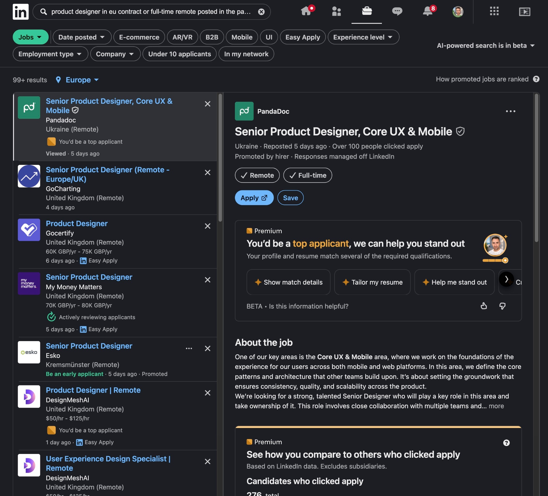
How the job detail looks today, before the cleanup pass.
The cleanup, in light and dark.
Same UI, two themes. Drag the handle to slide between LinkedIn's light surface and a dark version that reuses their own blue gray palette. No re-engineering, just the same components dressed for the night shift.